
<input>태그 중 radio타입에서 자주 구현되는 디자인 커스텀을 해 보기전에
먼저 radio버튼의 특성을 알아보자.
먼저 비슷한 checkbox와 비교해보자.
두 타입 모두 어떤 것을 선택하는 공통된 특성이 있다.
차이점은 checkbox는 중복 선택 가능하고
radio는 여러개 중에서 1가지만 선택 가능하다는 것이다.
🔎 예시
<div class="radio-group">
      <div class="radio">
        <input type="radio" name="gender" id="w">
        <label for="W">woman</label>
      </div>
      <div class="radio">
        <input type="radio" name="gender" id="M">
        <label for="M">Man</label>
      </div>
</div>
- name : 동일한 값을 주어 그룹핑 가능하다.
- id : <label>의 for 값과 동일할 경우, <label>을 클릭하면 자동으로 선택된다.
- checked : 설정시 기본값으로 선택된다.
위에 내용을 참고해서 html을 작성하고 css를 수정해보자.
먼저 기본 디자인을 보이지않게 처리한다.
input태그 중에 특정 옵션을 선택하고싶다면 [type=]에 옵션명을 작성하면 된다.
.radio-group .radio input[type=radio] {display: none;}
그렇다면 선택된 상태에서 css는 어떻게 줄까?
유형 선택자(:)와 함께 인접 형제 결합자(+)를 사용하면된다.
.radio-group .radio input[type=radio]:checked + label {background-color: #0091ff; color: #fff;}
💡 CSS 선택자
Css에선 다양한 선택자와 결합자가 있다.
우리가 자주 사용하는 온점(.)은 class 선택자이며 뒤이어 클래스명을 적으면 된다.
더하기(+)는 인접 형제 결합자이며
앞서 지정한 요소의 바로 다음에 위치하는 형제 요소만 선택한다.
class 선택자의 경우 자식요소만 선택할 수 있어
인접형제 결합자를 통해 같은 선상에 놓인 형제 요소를 선택해 속성을 변경할 수 있다.
코딩교육 티씨피스쿨
4차산업혁명, 코딩교육, 소프트웨어교육, 코딩기초, SW코딩, 기초코딩부터 자바 파이썬 등
tcpschool.com
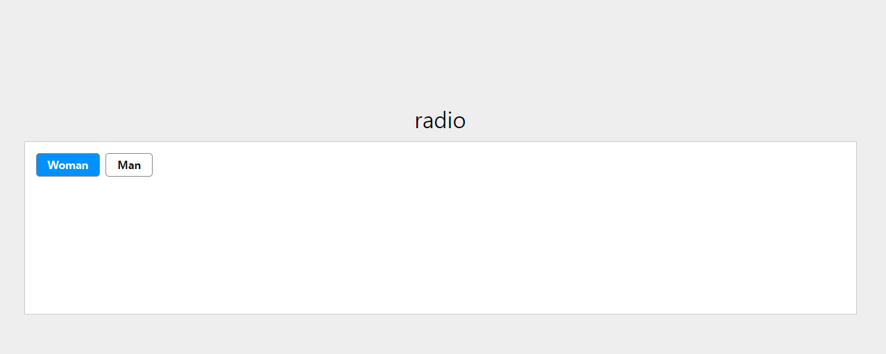
최종 코드
<head>
  <style>
    body {text-align: center;background-color: #eee;font-size: 10px;min-height: 100px;}
    h1 {margin-top: 10rem; font-size: 2rem; margin-bottom: 1rem;}
    .container {position: relative; margin: 0 auto; max-width: 1200px; min-height: 250px; padding: 1rem; background-color: #fff;border: 1px solid #ccc;}
    .radio-group {display: flex;}
    .radio-group .radio input[type=radio] {display: none;}
    .radio-group .radio input[type=radio]:checked + label {background-color: #0091ff; color: #fff;}
    .radio-group .radio label {font-weight: 600; display: inline-block; font-size: 1rem; padding: .5rem 1rem; border: 1px solid #888; border-radius: 5px; cursor: pointer;}
    .radio-group .radio:not(:first-of-type) {margin-left: .5rem;}
  </style>
</head>

<body>
  <h1>radio</h1>
  <div class="container">
    <div class="radio-group">
      <div class="radio">
        <input type="radio" name="gender" id="w" checked>
        <label for="w">Woman</label>
      </div>
      <div class="radio">
        <input type="radio" name="gender" id="M">
        <label for="M">Man</label>
      </div>
    </div>
  </div>
</body>
결과
응용 - ONOFF 버튼
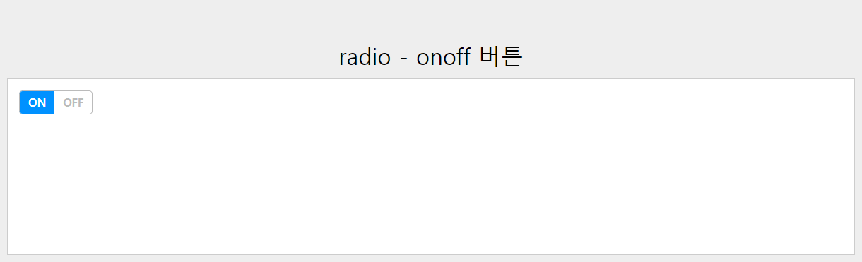
<head>
  <style>
    body {text-align: center;background-color: #eee;font-size: 10px;min-height: 100px;}
    h1 {margin-top: 10rem; font-size: 2rem; margin-bottom: 1rem;}
    .container {position: relative; margin: 0 auto; max-width: 1200px; min-height: 250px; padding: 1rem; background-color: #fff;border: 1px solid #ccc;}
    .radio-group {display: flex; width: fit-content; border: 1px solid #bbb; color: #bbb; box-sizing: border-box; border-radius: 5px;}
    .radio-group .radio input[type=radio] {display: none;}
    .radio-group .radio input[type=radio]:checked + label {background-color: #0091ff; color: #fff;}
    .radio-group .radio label {font-weight: 600; display: inline-block; font-size: 1rem; padding: .5rem .75rem; cursor: pointer;}
    .radio-group .radio:first-child > label {border-top-left-radius: 4px; border-bottom-left-radius: 4px;}
    .radio-group .radio:last-child > label {border-top-right-radius: 4px; border-bottom-right-radius: 4px;}
  </style>
</head>

<body>
  <h1>radio - onoff 버튼</h1>
  <div class="container">
    <div class="radio-group">
      <div class="radio">
        <input type="radio" name="onoff" id="on" checked>
        <label for="on">ON</label>
      </div>
      <div class="radio">
        <input type="radio" name="onoff" id="off">
        <label for="off">OFF</label>
      </div>
    </div>
  </div>
</body>
'Css' 카테고리의 다른 글
| 글 서식과 관련된 CSS 정리 (정렬, 자간, 행간 등) (0) | 2024.01.30 |
|---|---|
| nth-child 다양하게 사용하기 (1) | 2023.12.27 |
| Css에서 변수 사용하기 (0) | 2023.12.25 |
| object-fit (0) | 2023.12.22 |
| cubic-bezier (1) | 2023.12.21 |


